COVID-19 Data Visualisation App – A Year In Review
Last year when Scotland was in the midst of its first COVID-19 lockdown, Fios bioinformatician Jack Sleight had an idea. He thought a data visualisation app illustrating the daily COVID data from the Scottish Government would be useful, so he created one. Read on to learn more about the app and how it has performed in the last twelve months.
Creating the COVID-19 Data Visualisation App
Jack set the data visualisation app up as an open-access Shiny app written in R. Basically, the app displays clear visualisations which make the public COVID-19 data easy to understand.
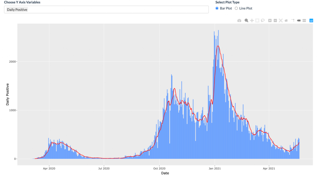
For example, the graph below makes it easy to see three clear peaks in the number of positive COVID-19 tests between April 2020 and April 2021.

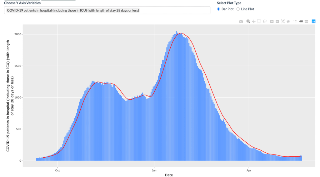
Since Jack’s app makes it simple to compare datasets, it is easy to identify correlations between the data. The peaks in the number of positive COVID-19 tests in November and January above clearly have a direct correlation to the number of COVID-related hospital admissions in the same period:

Ways To Use The App
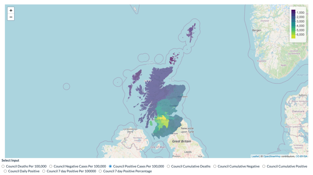
In addition to charting positive test results and hospital admissions, Jack’s app is used in a variety of other ways. For example, we can see where COVID-19 hotspots are:

You can also use the app to:
- Look at the 7 day rolling average of positive Covid-19 cases
- Check COVID data for a particular council area
- Check vaccine supply and doses
- See a snapshot of how COVID-19 is affecting Scotland at any given time
Who Has Been Using The Data Visualisation App?
To date, over 500 individuals from 10 countries have used the COVID-19 Data Visualisation App. Obviously finding it useful, many app users have used it more than once, contributing to a total of 1,500 sessions so far. We asked Jack how he feels about the app’s popularity:
“I am very pleased with the response I’ve had for my COVID Shiny app. It started just as a personal project to work on during the first lockdown but has grown massively since the early versions. It has also gained some traction with academic and industry colleagues which has been really pleasing. Hopefully people have got some use out of it over the last year and have been able to keep up to date with how the pandemic is unfolding across Scotland.”
Indeed, Jack’s industry colleagues have taken a clear interest in the app. In March 2021, Jack was invited to discuss the app at the Edinburgh Data Visualisation Meetup where he discussed why he decided to build the app and how he went about it.
Of course, the most important thing about Jack’s app is that it shows how Scotland is coping with the COVID-19 pandemic. To see what the COVID picture looks like in Scotland right now, simply visit the app.
You may also be interested in:
Bioinformatics Reveals link Between COVID-19 Symptom Severity And Immune System Adaptivity

